Choosing Between Unity and Unreal for Mobile Games
A practical comparison of the two major engines. We break down performance, ease of use, and what each platform does best.
Read ArticleTouch controls, small screens, and short play sessions change how you design. Learn the principles that separate games players actually enjoy from ones they delete after five minutes.

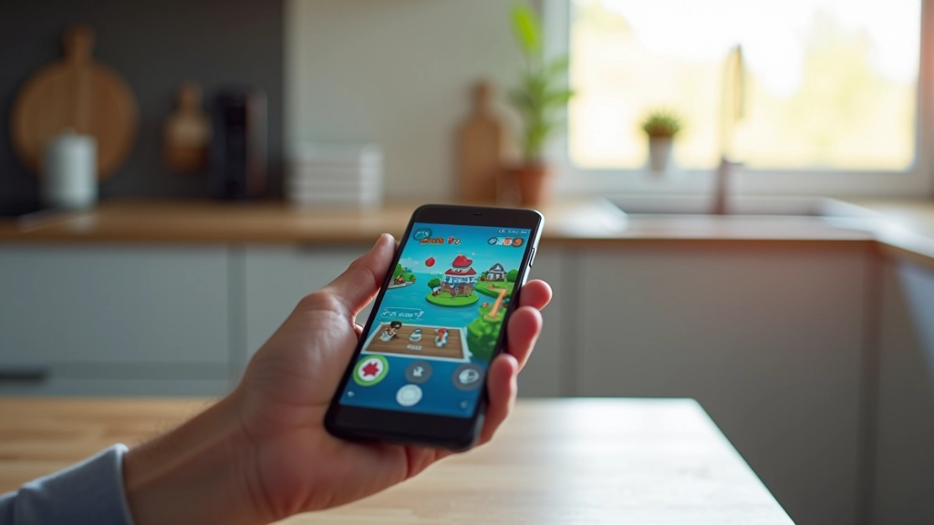
Mobile games aren’t just smaller versions of console games. They’re a completely different animal. When someone’s playing on their phone during a lunch break or on the bus, they’re not settling in for a three-hour campaign. They’ve got maybe five to fifteen minutes. They’re interrupted. They’re distracted. And they’ll abandon your game in seconds if it doesn’t grab them immediately.
That’s the reality you’re designing for. And it changes everything about how you approach game design — from the core mechanics to the UI to how progression feels. We’ve been shipping mobile titles for over a decade now, and these fundamentals are what separate the games that get played from the ones that get deleted.
This is the first and most obvious difference, but it’s worth getting right. Your controls need to feel natural on a touchscreen. That means bigger hit targets than you’d ever use on a controller. We’re talking about 48-64 pixels minimum for interactive elements — fingers aren’t as precise as thumbs on a D-pad.
But there’s more to it than size. One-handed play is critical. Most people are holding their phone in one hand while they’re doing something else. So your core actions — jump, attack, interact — should be reachable from the bottom corner or middle of the screen without stretching. Avoid putting essential controls in places you can’t reach comfortably with your thumb.
Gesture controls can work, but they’re risky. Swipe, pinch, and long-press mechanics feel great when they’re polished, but they’re easy to mess up. If you’re going to use them, test with actual players on real devices. Not in your editor. On actual phones with actual people’s thumbs.
Educational Note: This article provides design principles and best practices for mobile game development. These are guidelines based on industry standards and experience. Your specific implementation should account for your target audience, device capabilities, and game genre. Always test with real players on actual devices during development.

Your game’s running on a 5-inch to 7-inch screen. Everything’s smaller. Text needs to be readable at arm’s length without squinting. UI elements need breathing room. You’re fighting against clutter.
This doesn’t mean making the game itself simpler — it means being ruthless about what you display. Show only what matters right now. Hide stats you don’t need in the moment. Use clear iconography instead of text where possible. We’ve found that limiting the number of on-screen UI elements to four or five at a time makes everything feel cleaner and less overwhelming.
Aspect ratio matters too. You’re designing for everything from 16:9 screens on older phones to the taller 18:9 and 19:9 ratios on newer devices. Avoid critical gameplay elements at the very edges of the screen. Center the action, and let the UI adapt around it.
Mobile gaming is episodic. A player’s session might last two minutes or twenty. They could get a phone call and need to quit immediately. Your game needs to handle interruptions gracefully. That means automatic saving. That means no progress lost if they close the app.
Think about level design and session structure. A three-minute level is perfect. A five-to-ten-minute session for a match or round works well. Anything longer and you’re asking a lot from someone on their phone. If your game requires longer play sessions, build in natural stopping points. Checkpoints. Wave completions. Turn-based mechanics that let players pause between actions.
We’ve also learned that progression should feel rewarding even in short bursts. A player who spends five minutes in your game should feel like they accomplished something. They unlocked something. They progressed. That keeps them coming back tomorrow.
You’ve got about sixty seconds before a player decides whether to keep playing or delete your game. That’s it. No lengthy tutorials. No story scenes they can’t skip. They want to play.
Get them into actual gameplay within thirty seconds. Teach mechanics through play, not exposition. Show them what to do instead of telling them. A quick visual guide that appears as they play works better than a ten-slide tutorial. Players learn faster by doing.
The first level or match should feel good. Make it slightly easier than what’s coming. Let them win. Build confidence. By the time difficulty ramps up, they’re already invested and understand the systems. We typically spend as much design time on those first two minutes as we do on the entire rest of the game.
Mobile players want to see growth. Not just in difficulty, but in actual progression. That could be unlocking new characters, abilities, weapons, or cosmetics. It could be climbing a leaderboard. It could be completing a campaign. Whatever it is, make progress visible and frequent.
Avoid long grinds where nothing changes for thirty minutes. Players on mobile get bored fast. Give them something new every few minutes of play. A new power-up. A harder enemy type. A visual change. A small story beat. Something that signals “you’re making progress.”
And don’t hide progression behind walls. If they need to play for hours to unlock the next tier, they won’t stick around. Progression should feel achievable. A committed player should unlock something meaningful every session. That’s what keeps them coming back tomorrow.
These aren’t revolutionary ideas. They’re fundamentals that successful mobile games follow. Respect the platform. Respect the player’s time. Make every interaction count. Design for the device. Build progression that feels good. You don’t need gimmicks or trendy mechanics — you need solid design that works for how people actually play on their phones.
When you’re building your mobile game, come back to these principles. Test them with real players. Iterate based on how people actually interact with your game. That’s how you go from “deleted after two minutes” to “played every day.”